ART IS SUBJECTIVE, LET'S PREFACE WITH THAT...
"Made me feel stupid, talks down to me"
These are comments that people have said about me in the past. And I'm not talking about years ago, but recently as well. As well as trying to take the trophy off of Dave Grohl for being the nicest guy in rock music, I do have a limit with my patience and understanding. I regularly go into deep rants on my comic podcast (THE UNDEAD COMIC CAST), and have been known to throw harsh insults at my fellow Nerdy team during heated debates on our annual NERDIES livestream (I once told Chris he looked like he had eaten 3 of his younger self, he wasn't impressed). With that said I can be brutally honest and that's what this blog is going to be. Brutal but honest.
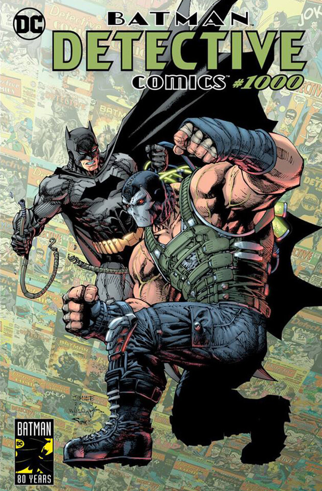
I know I'm going to get people who read this and say "WELL LET'S SEE YOU DRAW THAT" and I have to admit I couldn't, HOWEVER if you are going to put your work in the limelight, and charge for it, that invites criticism and judgement. And one thing that has plagued my mind the past few months was the lack of great covers drawn for DETECTIVE COMICS #1000 and how everyone seemed scared to talk about that.
The comic hit a major milestone back in March, and in the weeks leading to it more and more artists said they were on board for designing covers for the book. I eagerly awaited the sheer volume of top quality art I was going to be spoiled for choice over, instead I was left as deflated and uninspired as Morrisey's air-filled sex doll. You shouldn't judge a book by it's cover, but you can judge the cover. Let's do this.
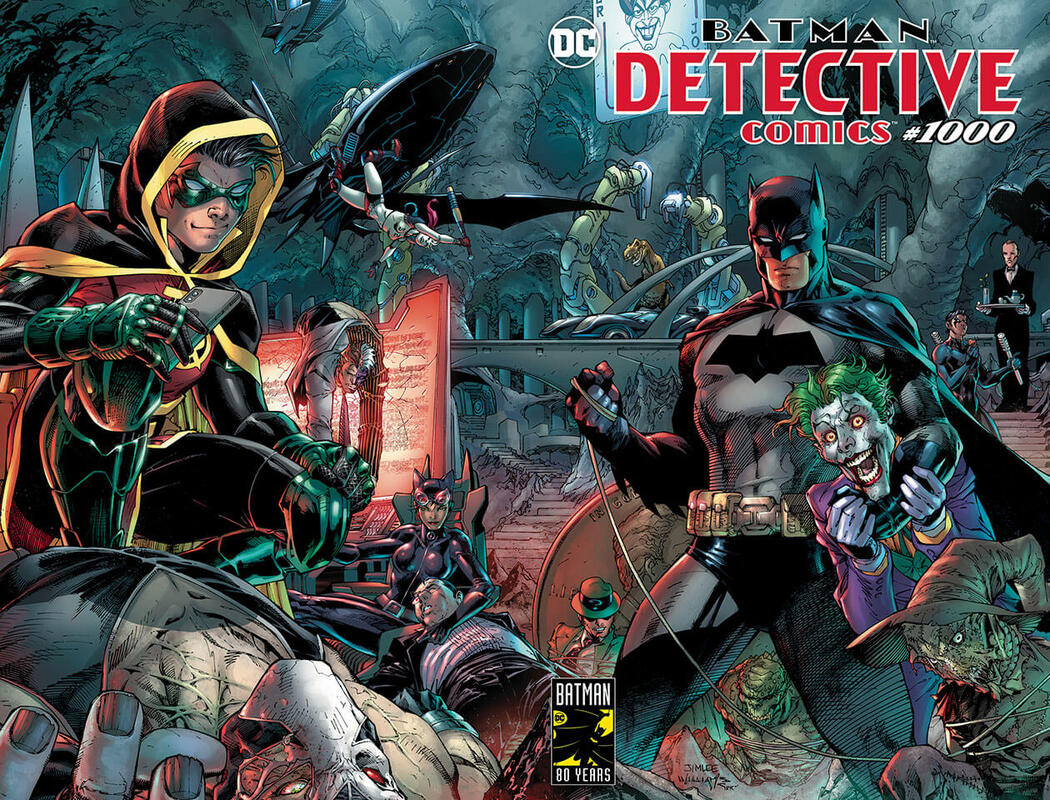
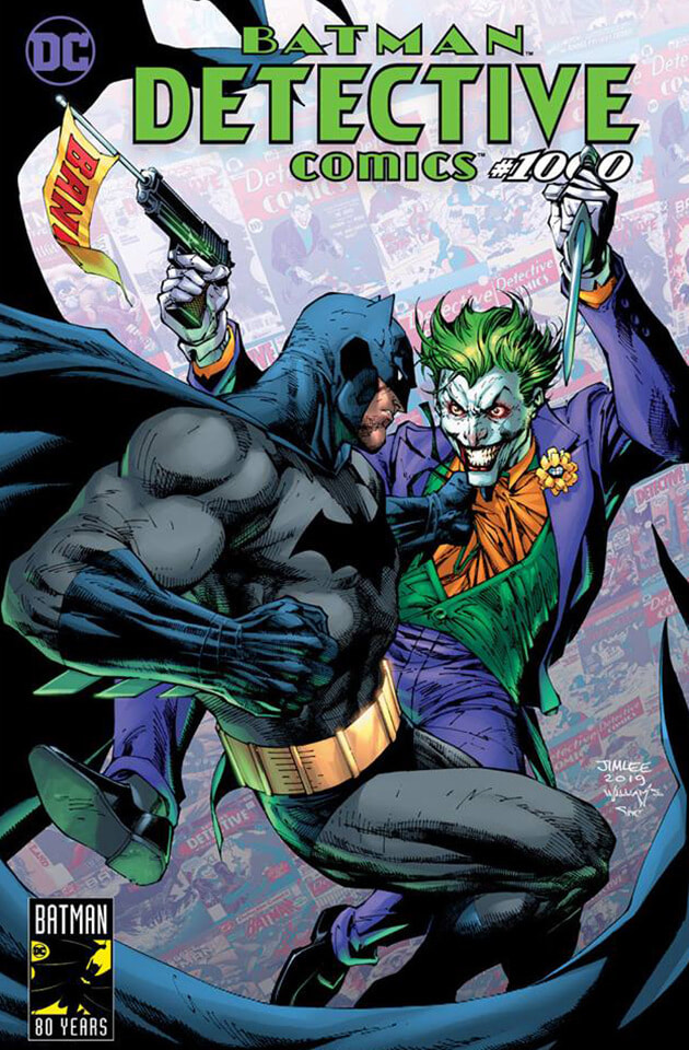
Scott Williams & Jim Lee Cover
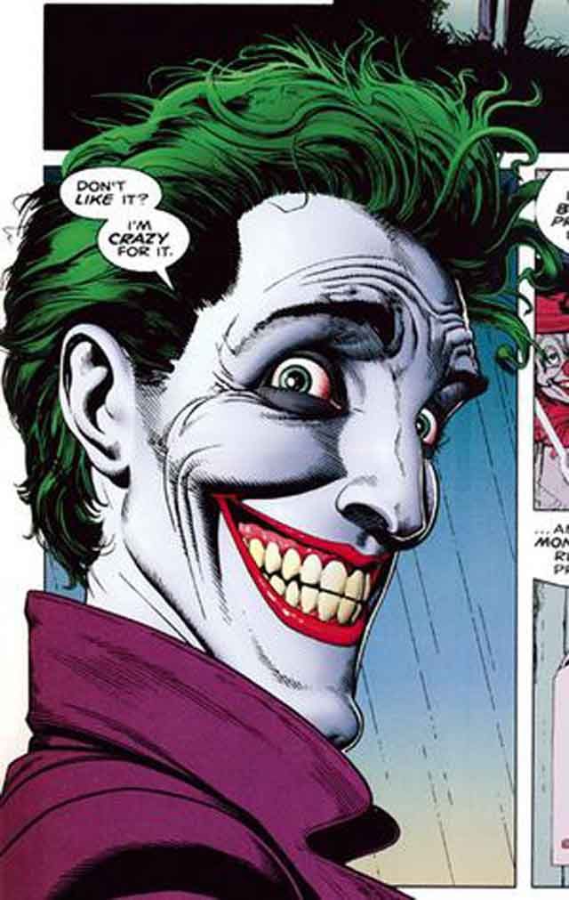
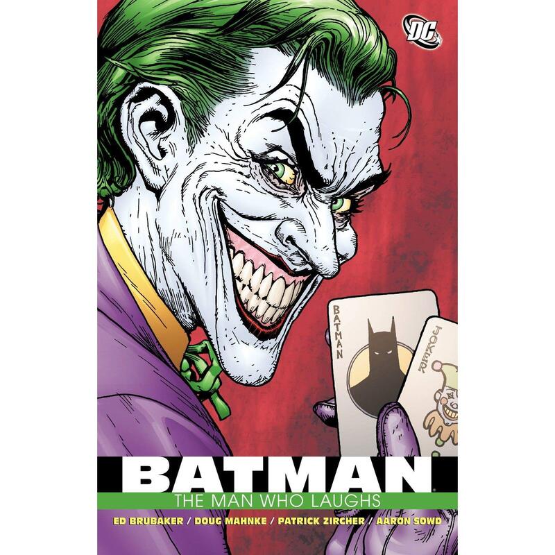
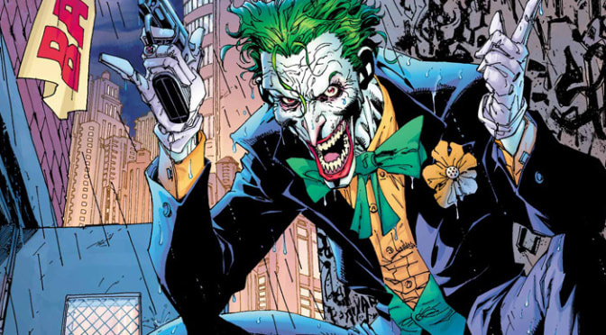
Not bad. A lot going on, a lot of references to various threads of Batman lore, however closer inspections just don't please the eye. Damien has an iPhone, why? Is he googling the symptoms of jaundice perhaps? I only ask because what is wrong with the Joker? Why has he got goat eyes? I will never get why Joker can be a chore for some people to draw. Look at these and then look back at him on the cover:
Not bad. A lot going on, a lot of references to various threads of Batman lore, however closer inspections just don't please the eye. Damien has an iPhone, why? Is he googling the symptoms of jaundice perhaps? I only ask because what is wrong with the Joker? Why has he got goat eyes? I will never get why Joker can be a chore for some people to draw. Look at these and then look back at him on the cover:
I mean, there's a subtle yellow tinge that makes your mind wonder is his skin more pale than the white of his own eyes? Is he on something? But not as extreme as those literal piss holes in the snow he has there. Also I feel Batman looks very stiff and basic here. I'm getting more personality off of Damien than I am Batsy.
6 out of 10
6 out of 10
|
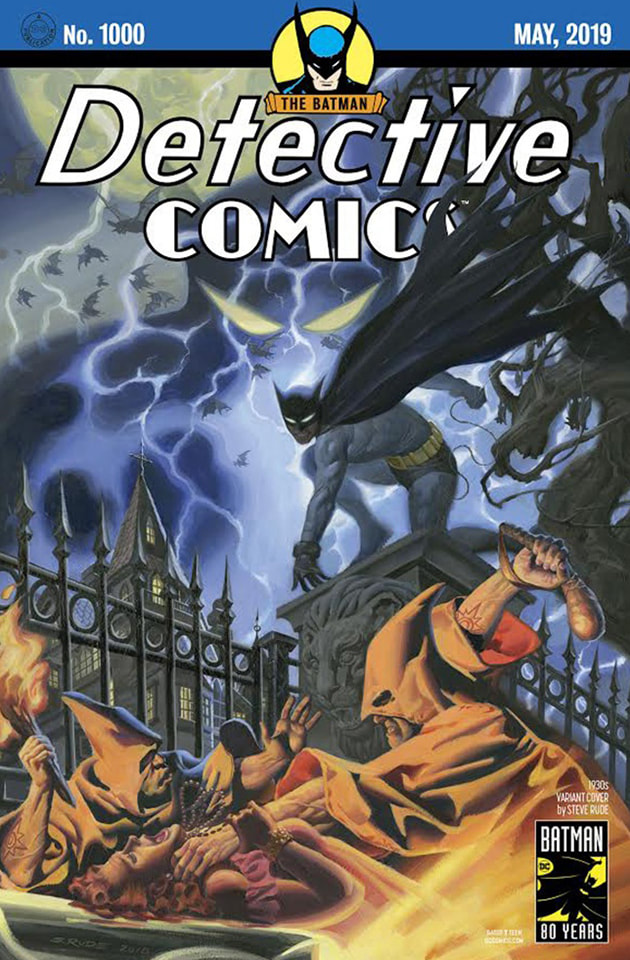
Steve Rude 1930s Variant Cover
Very dark and gothic. Reminds me of the Iron Maiden video for 'BRING YOUR DAUGHTER TO THE SLAUGHTER'. Admittedly one of my issues is with the style of Batman's cowl but I know that isn't Steve's fault, that's just how he looked then so I'll let that slide. I guess I can't really argue too much against this because I feel a lot I don't like about it is personal taste. I like bold lines, brighter colour combinations, and I like simplicity. Sometimes, anyway. There's far too much going on here and not in a Green Day 'DOOKIE' album cover kinda way. A good effort, just not to my taste. 6 out of 10 |
|
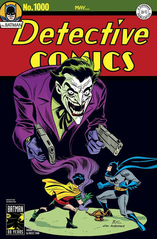
Bruce Timm 1940s Variant Cover
I actually really like this. If you look at it, it ticks all the boxes I have mentioned already. Simple? Check. Bold lines? Check. Does Batman look good? Check. Joker has no visible kidney issues? Check. There isn't anything to not like about this to be honest. The concept itself is clever and has as many layers to it as you want it to have, depending on how far you want to believe that Bruce Timm thought about it. 9 out of 10 |
|
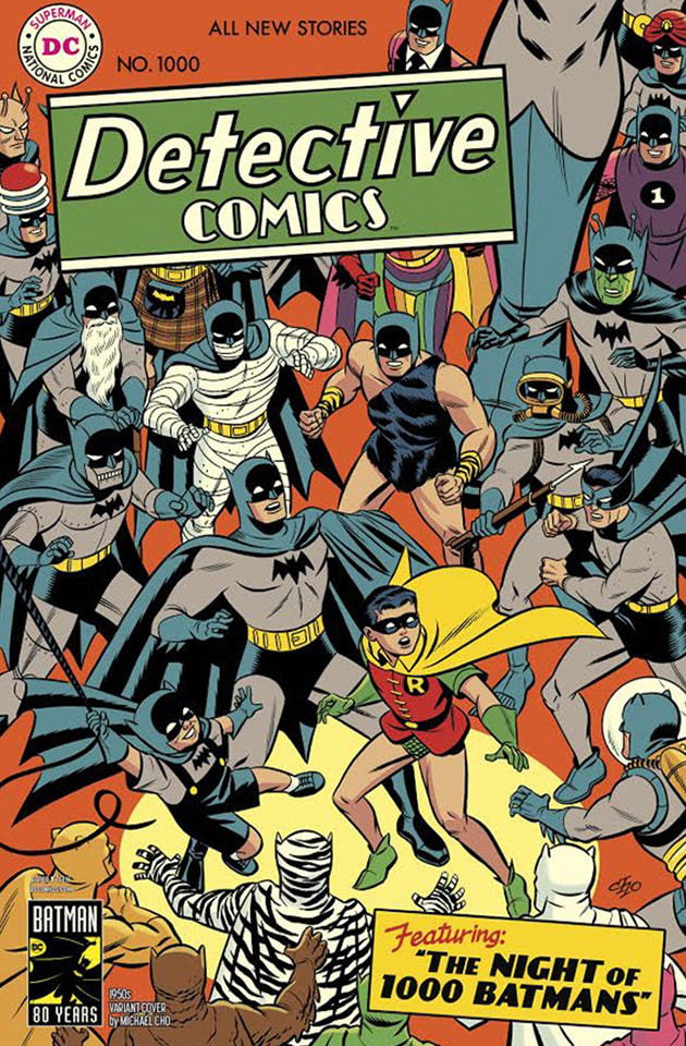
Michael Cho 1950s Variant Cover
The one I ended up buying and easily one of my favourite Batman covers. See? This isn't a petty hate fest, I just don't get why a lot of covers couldn't have been this same level of fun. It makes you smile just to look at it and is a 'feast for the eyes', as Chris would say. I especially love how Batman himself is drawn. I feel you could see whatever Batman you want under that cowl. I personally see Adam West, you may see Affleck, I don't know, all's I know is that it's great and an effort I wanted to see from every artist on this edition. 10 out of 10 |
|
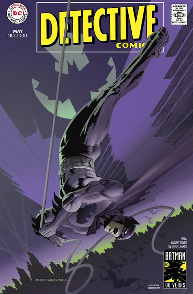
Jim Steranko 1960s Variant Cover
Maybe I'm wrong but I really don't get a 1960's vibe from this. This looks more like an advert for Cadbury's Milk Tray than a cover for Batman. Even the Bat-signal is weird and looks like it has feathers. It's not bad perse but I just don't think it has any quality about it that makes it stand out, something that I noticed a lot during this blog. I mean, I kinda feel like I totally forgot this existed. Also if you turn your head upside down, Batman looks like he's shouting like Tarzan. 5 out of 10 |
|
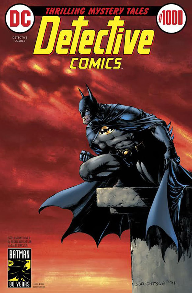
Bernie Wrightson 1970s Variant Cover
Now this I can dig. Brooding but with vibrant, hellish reds. The Bat-signal burning dimly in the sulphuric clouds and Batman himself, in a Spawn-esque pose. It's not a million miles away from how Kelly Jones draws him, sans some mad colour choices. My only negative feeling towards this is it is isn't the most distinctive Batman cover drawn. How many times can he be drawn brooding looking down from a tower over Gotham City? That being said, it doesn't lack a character entirely of its own, and I love that both the T's are crosses. 8 out of 10 |
|
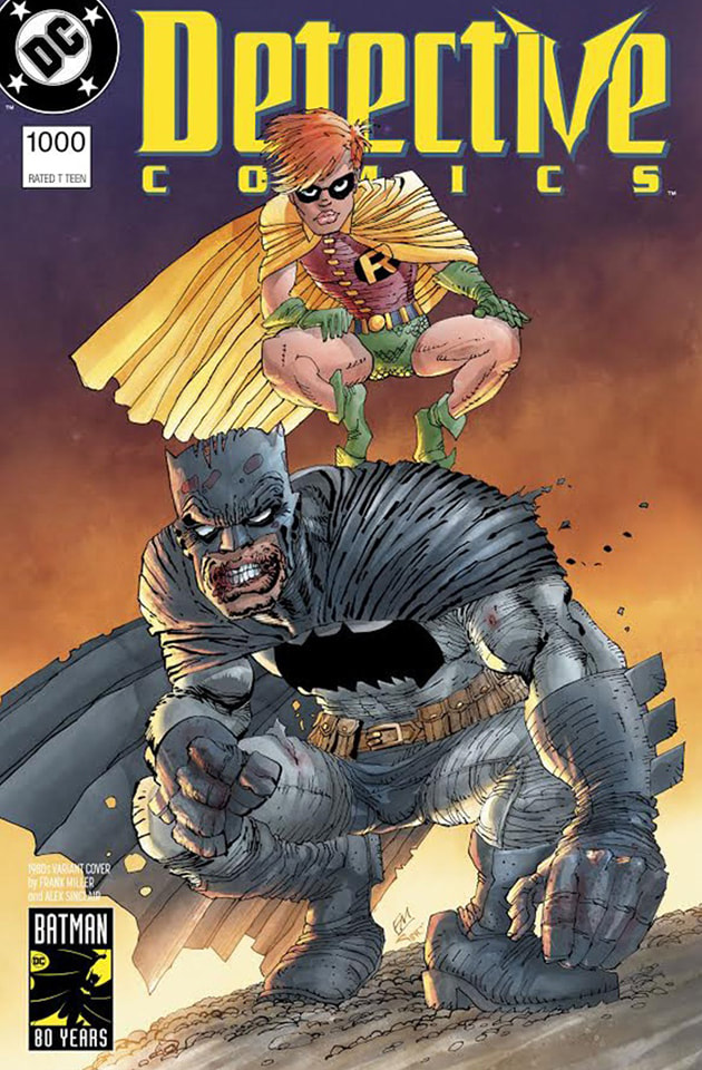
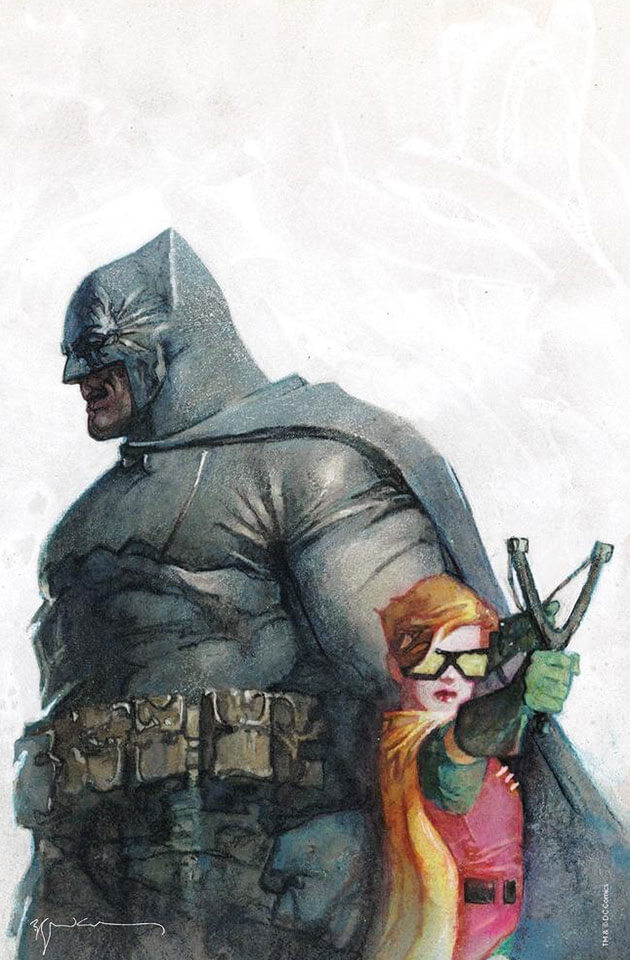
Frank Miller 1980s Variant Cover
Can Frank Miller draw? A question that has plagued DC fans for decades. I don't think that's the right question. It's, 'Why can he not draw consistently?' There's nothing intrinsically wrong here, on the other hand, it's pretty fucking ugly. Batman looks like he ran out of chapstick months ago and Carrie Kelley has thunderthighs. He's drawn better, he's drawn worse. Another very subjective cover, I don't have any personal qualms with it, yet I would understand if people did. 7 out of 10 |
|
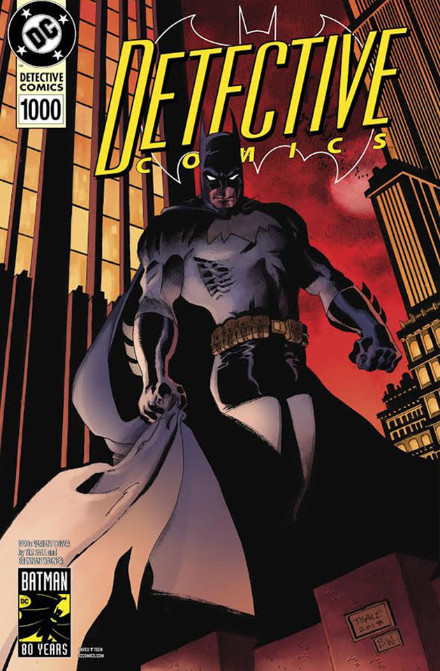
Tim Sale 1990s Variant Cover
I HATE this cover. Whereas I just described Frank Miller's as ugly, it still had a charm and character about it. Like the elephant man. This looks sloppy, first draft shit. Like Wayne Rooney. I don't dig the black hotpants and Batman's face is a purplely red with a gurning mouth like a whisky sozzled drunk having a stroke. The backdrop is epic and beautiful but Batman just looks like he has been illustrated using a bad stencil kit. Even his badge looks like it was thrown on, almost like it was forgotten from the original design. A nice colour palette and cityscape save this from getting a worse score. 2 out of 10 |
|
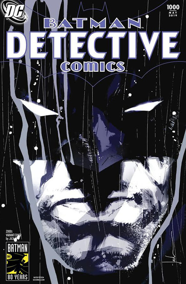
Jock 2000s Variant Cover
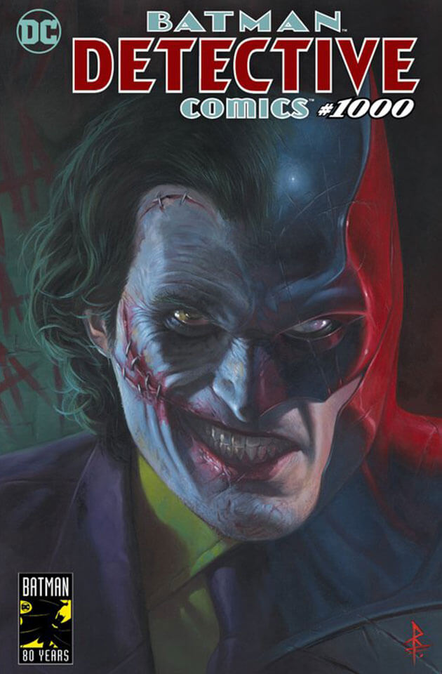
Looking a distinct shade of Parma Violet, this stands as a nice piece of art but falls into the same issues I had with Jim Steranko's. It's the 80th anniversary of Batman and Detective Comics want you to design a cover for issue #1000 so you though that a grizzled portrait of his face in the rain would be groundbreaking? Memorable? Would stand out and visually mark the occasion? Like I said, it's 'nice' and 'nice' is harmless. A cup of tea is 'nice', this should have been so much more. Maybe more vibrant colours or easter eggs to Batman lore cleverly traced into the darker spots. This just comes off as a bit bland for me is all. 5 out of 10 |
|
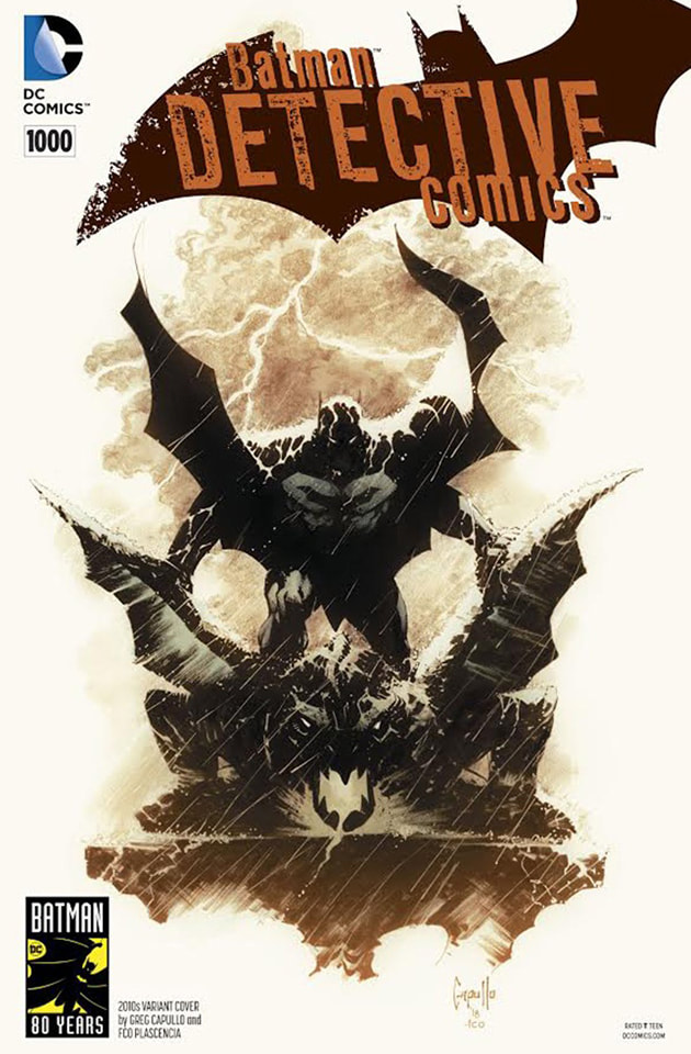
Greg Capullo 2010s Variant Cover
This is a sore point for me and definitely soured because of the a chip on my own shoulder. Capullo has drawn some of my favourite Batman panels and, in all honesty, is one of my favourite artists. So my expectations were extremely high for his cover. My issue with this is that it looks very minimalist for him. I know I said 'I like simplicity' but I can't help but feel that a good portion of the canvas is just not being used. And the sheer WHITE of the piece is very un-Batman. He is the NIGHT. Not the BMW 1 Series White. 5 out of 10 |
|
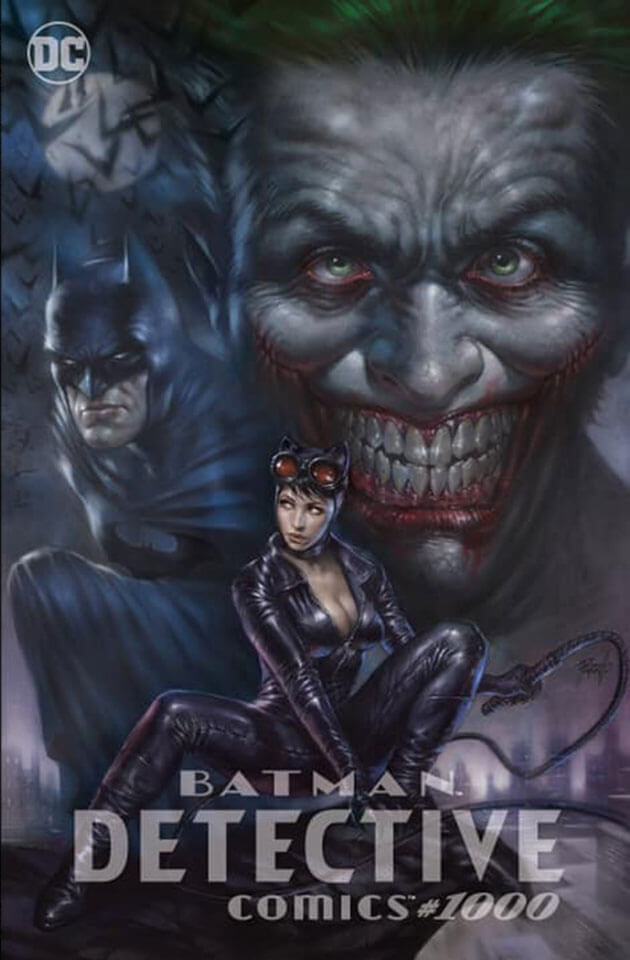
Scorpion Comics Lucio Parrillo Trade Dress Variant Cover
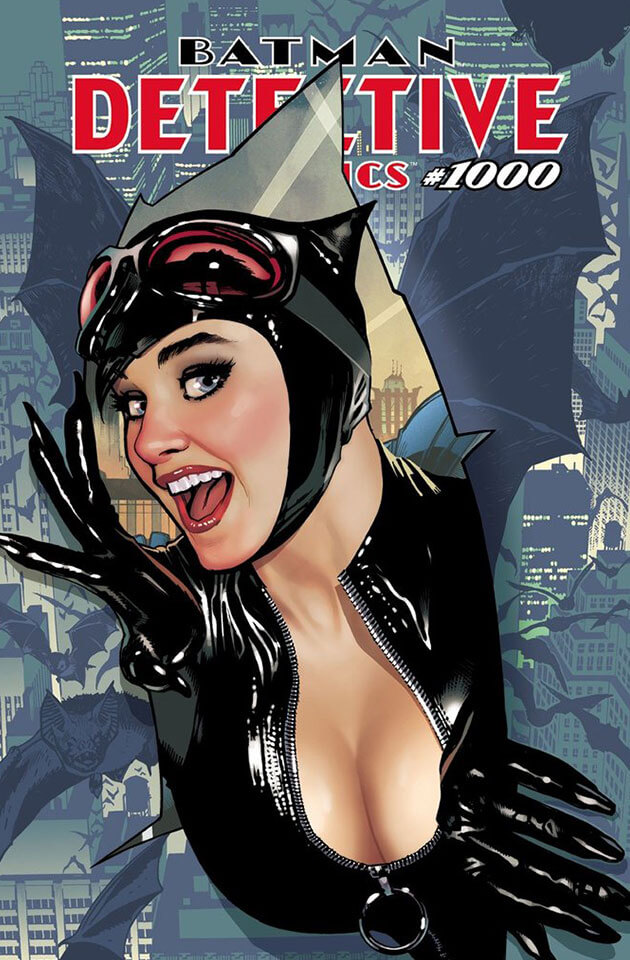
Not bad. I just feel like Catwoman is on here for Catwoman's sake. I feel something much stronger in Bruce Wayne's history could be the prominant feature of this cover other than a top busting Selina Kyle. I'm not against drawing the character any particular way, artistic freedom and all that, however if you take her out the drawing, ask yourself, 'what tone does it have without her' and 'what is she adding to this art'? This piece, for me, gives off a Hammer-Horror vibe. Not meaning to be blood curdingly scary, but the stuff of your childhood nightmares and fears. Then slap Zoo Magazine Selina on to what end? Sex it up? Again, I'm not shaming Catwoman, the only shame here is that a great looking cover got tarted up. 6 out of 10 |
|
Planet Comicon Kansas City Doug Mahnke "Arkham Knight" Trade Dress Variant Cover
This unfortunately suffers from a total lack of love for the villain behind Batman. I get that the end of the issue reveals that the Arkham Knight is to be the next for Batman was to face in the run after this, it doesn't mean he deserves the epic stance on Detective Comics #1000. Why not one of Batman's more well known classic foes? I won't hold a grudge on it though, I know that this is just a 'me' thing. 8 out of 10 |
|
Kings Comics Nicola Scott Variant Cover
Another mult-Batman cover and I like it. He's been around for 80 years and had many iterations, why would you NOT play on that? Admittedly this isn't my favourite art style but I totally respect what this is doing. A lot of nods to movie Batmans here, something that we actually haven't seen anything of yet, which is MADNESS when you think about it. I don't even mind Batman smiling with his teeth open at the back, something that Batflecks Batman did not get away with in Justice League. He just looked like he was passing gas. 8 out of 10 |
|
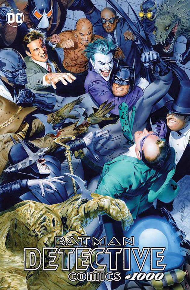
The Comic Mint Mike Mayhew Trade Dress Variant
This is Alex Ross worthy. So many shades of Batman are littered across this cover, and so many enemies from varying decades. From the underappreciated Black Mask to recent Court of Owls lurking in the background. It's so symbolic as well, representing all the varying degrees of problems Batman has to face in Gotham, with Joker holding him closest. Everyone looks great and the Riddler getting the uppercut is the cherry atop the cake. Frameworthy. 10 out of 10 |
|
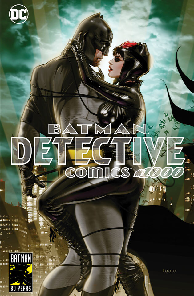
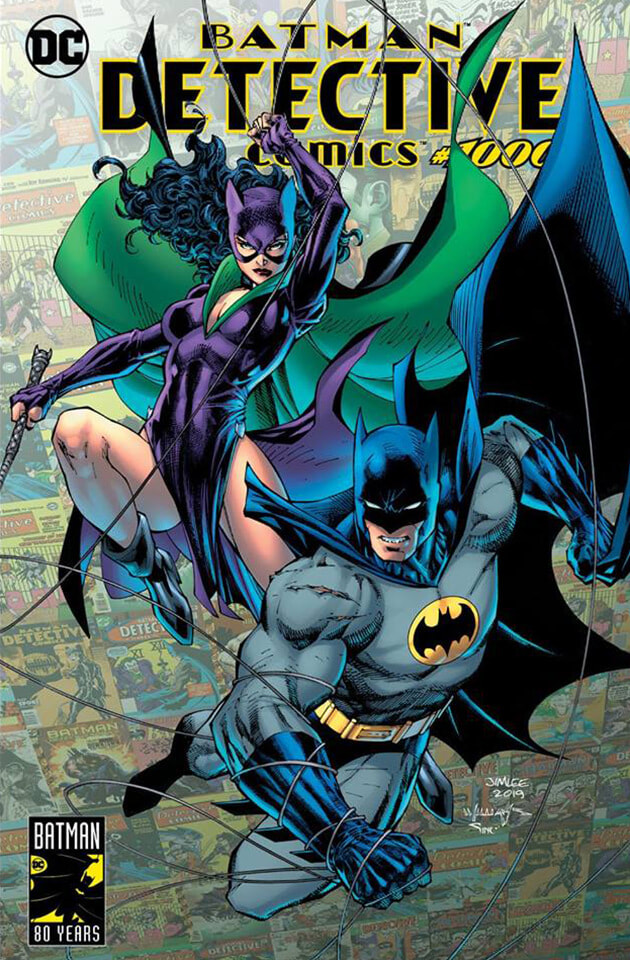
Third Eye Comics Kaare Andrews Variant Cover
This is how you do a Bat and Cat cover. Imagine adding a manic Joker at the front of this for no real reason. The detail is gorgeous, down to the light reflecting off of Catwoman's suit. The more I look at this, the more gutted I am I didn't get it. I love how Batman is somehow emoting through his cowl, without taking away from his classic stoic look. Selina looks like the singer of the Cranberries too! B-E-A-UTIFUL. 10 out of 10 |
|
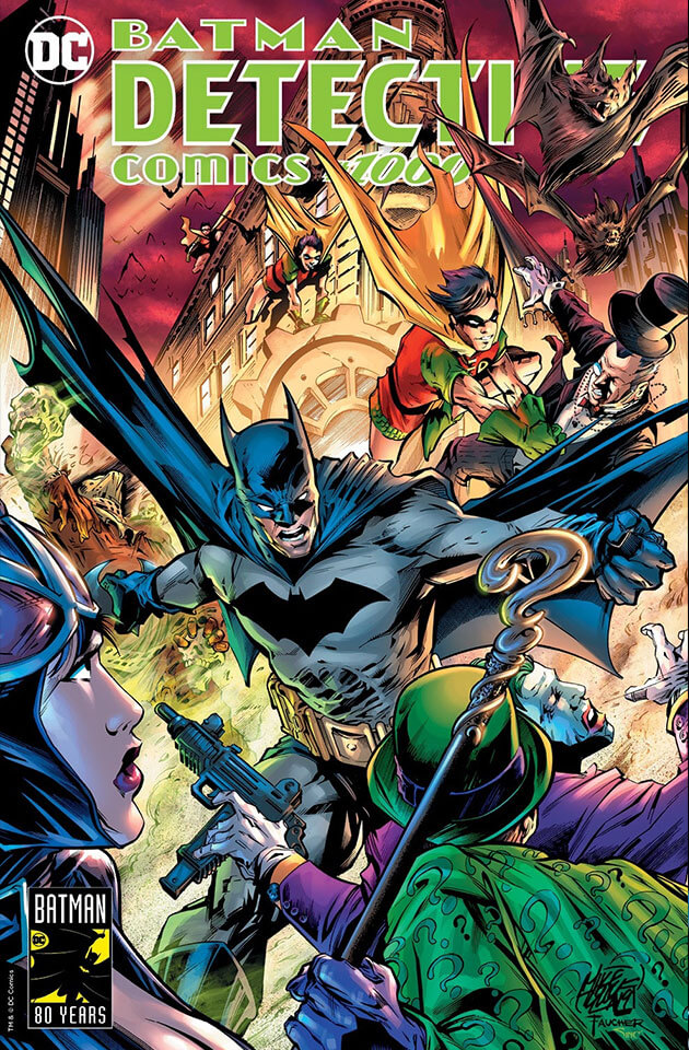
Comics Vault Mike Lilly Variant Cover
A classic Batman villains roster, bright colours and multiple robins decorate this cover that truly shows up some of the piss poor efforts we've looked at before this. Some things are amiss though. Joker's face isn't drawn well, neither is the face of the nearest Robin either. And someone was REALLY desperate to get Catwoman's Selinas into the shot. Apart from that, a great cover that really does help eccentuate that this is a momentous issue for Batman. Mike Lilly got the memo, why didn't our next artist? 7 out of 10 |
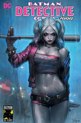
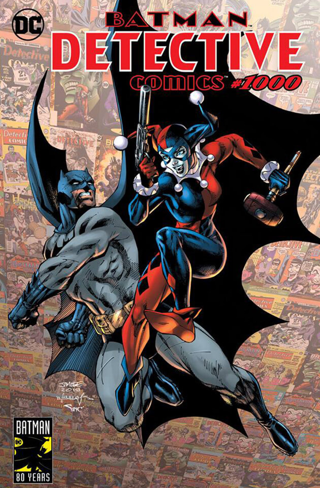
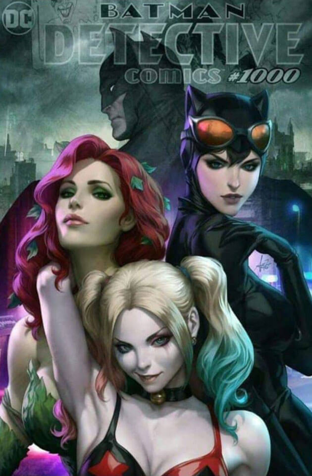
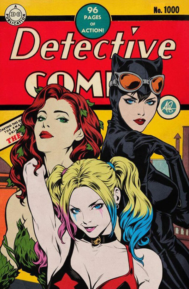
Frankies Comics Jeehyung Lee Trade Dress Variant Cover
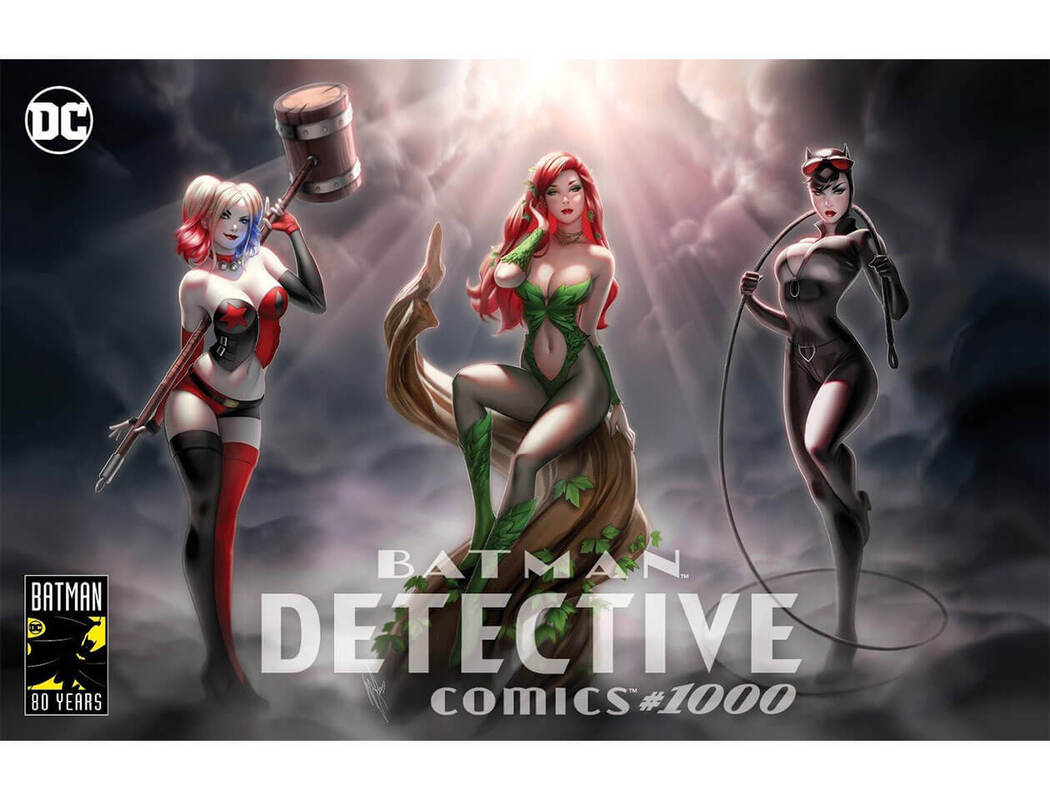
Has Mr Lee only just heard of Batman this year? Let's ignore how well it's drawn and think about WHAT he's drawn. He gets asked to do the cover for Detective Comics #1000; a Batman based comic that has spanned 80 years. He decides his contribution should be a drawing of the most recent , mainstream, Harley Quinn, a version that is commonly thought of to be the WORST version of this beloved character, and an embodiement of everything wrong with comics catering to the mainstream. And he uses that to front the cover of Detective Comics #1000. Is he literally that detached from Batman and its surrounding culture? Is that even possible? I mean...why not draw original Harley? Why this?? This would be like celebrating an anniversary of Breaking Bad by showing that clownshoes FLY episode in every cinema.
The sad thing is, he can fucking draw! He's amazing and better things are then to be expected. He should have challenged himself, instead of making what looks like DCEU fanart. Loses most marks not for how it was drawn but for missing the point of this opportunity COMPLETELY!
1 out of 10
|
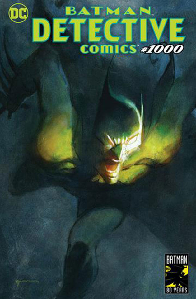
Bill Sienkiewicz Variant Cover
I'm not sure what I am looking at and I cannot tell if I like it. Two tabs of mescaline and this would be the WORST thing to have hung up in my house. It's true art as it could have 100 different interpretations. I, for one, see this as what anyone on Scarecrow's FEAR toxin would see the Dark Knight. Nightmare-ish and quite haunting, I have quite a bit of time in my day to stare at this. 8 out of 10 |
|
Bill Sienkiewicz DKR Homage Variant Cover
Batman looking THICC here. I mean it. He's not just 'wide' he is 'WODE'. Almost making Carrie Kelley look unnecessary here, this cover shows the towering, brutish looking DKR in all his glory. A fine homage to an amazing version of the Bat. Exactly the kind of idea and calibre of work I would expect sent to my desk if I had commisioned a Detective Comics #1000 cover off of you. 9 out of 10 |
Now let's run through a few a bit quicker, yeah?
|
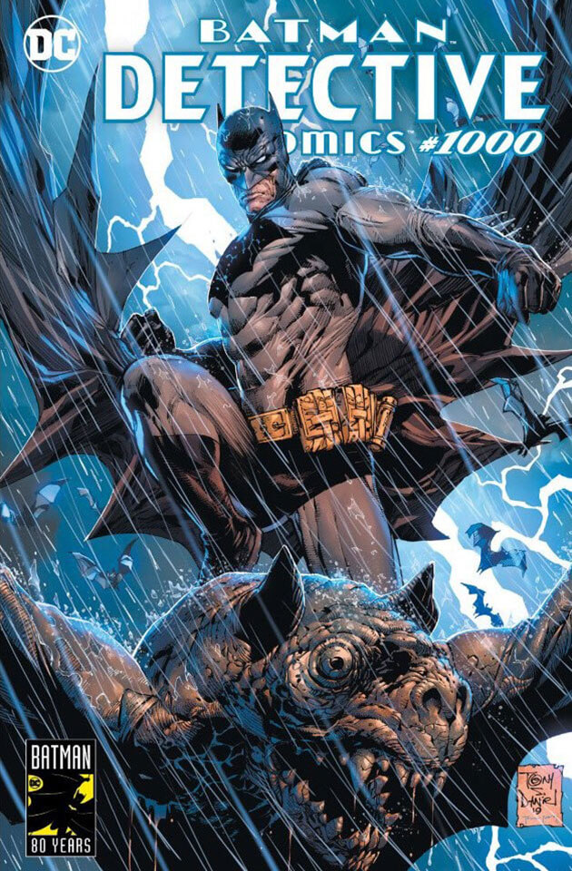
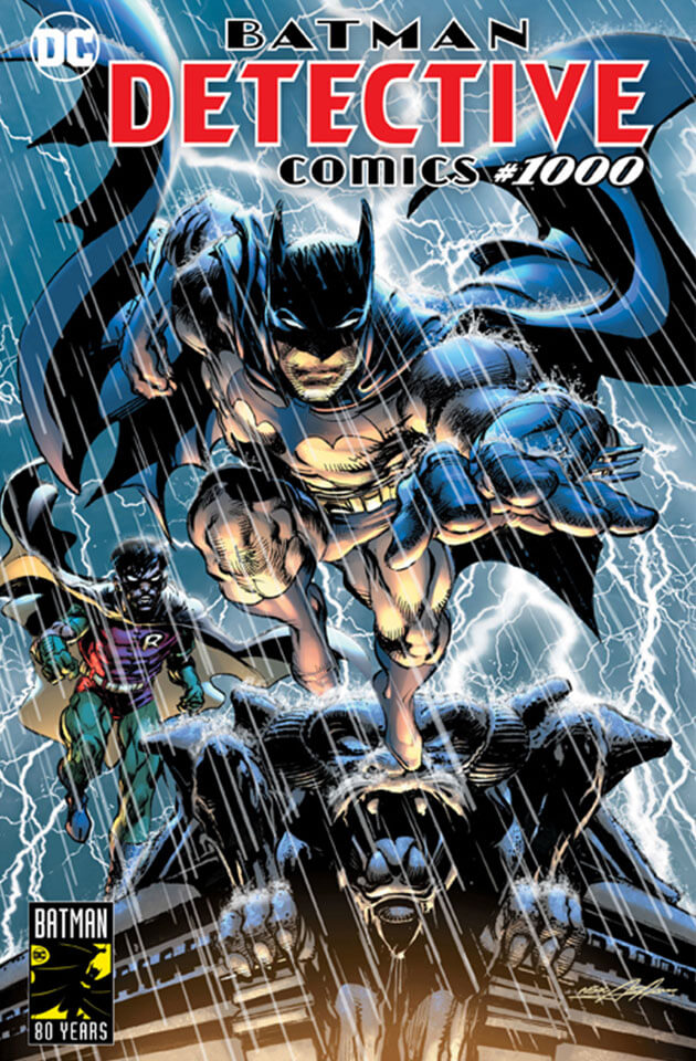
Comic Stop Tony S Daniel Variant Cover
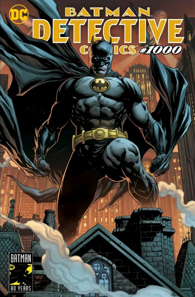
Looking more like something the above Mr Fabok would have drawn for one of his BATMAN ETERNAL covers, this is a great looking shot of the Dark Knight atop a gargoyle amidst a storm. The lighting and attention to detail on the rain is sublime and certainly wipes your mind of anything remotely silly that Batman has ever been associated with. 9 out of 10 |
|
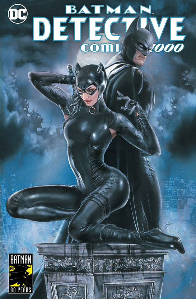
KRS Comics Natali Sanders Trade Dress Variant Cover
I do like this even though Catwoman looks like she's trying to imitate that Ariana Grande album cover. I love the moonlight reflecting off of their costumes and even the detail of Selina having holes in the pit area because she'd be a sweaty kitty if if it wasn't a bit breathable. Points lost on giving her an arse like Kim Kardashian though. How could she acrobat through lasers with that big ol' baznuka on the back? 7 out of 10 |
|
Unknown Comics Jay Anacleto Trade Dress Variant Cover
I'm really confused by the tone here. This kind of makes Batman look somewhere between Scarface (a criminal drug baron) and a pimp. Neither are a good look for the Dark Knight. and between the bulge and the breasts, my eyes are unsure where to look. Another artist whose work I can see is talented but just has misplaced their judgement on the concept. 4 out of 10 |
|
Comics Elite Dawn Mcteigue Trade Dress Variant Cover
I was unaware that Playboy was designing a cover. Dawn seems to specialise in drawing characters to look like teenage wet dreams. That kind of imagary is fine for Dangerzone comics, Heavy Metal comics or even those books your lonely auntie has by the side of her bed that describe how Rufios member urgently needs freeing from his denim prison, but not to celebrate 1000 issues of a book like Detective Comics. Irrelevent material made to fish for awkward boners. 1 out of 10 |
|
ComicXposure Riccardo Federici Trade Dress Variant Cover
Another one that would make your LSD trip take a dark turn. I feel like I see something a bit different in this each time. Obviously the symbolism of showing the Bat and Joker as one face isn't lost on anyone, nor is it original, but I feel Riccardo has a style all of his own and has made a cover I would be proud of. It's a grower that you can show off proudly on the wall. 8 out of 10 |
|
Forbidden Planet Brian Bolland Trade Dress Variant Cover
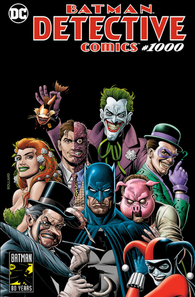
No one on this cover looks remotely real. Riddler looks like Slappy the doll from Goosebumps. Joker looks Chinese. Penguin looks like if Winston Churchill had gone through a Goth phase. Poison Ivy looks like she does YouTube videos on makeup contouring. And for a man with not one but TWO faces, Harvey Dent looks emotionless and wooden. I'd be as happy as Batman is in this drawing if I were to own this. 3 out of 10 |
KRS Comics Warren Louw Trade Dress Variant Cover
No one:
Absolutely no one:
Not a single soul:
Warren Louw: "BOOBIES!"
I wouldn't be surprised if Warren's entire income went on questionably named subscription sets. Definitely paying for a few Cosplayers Diamond Tiers on Patreon.
1 out of 10
No one:
Absolutely no one:
Not a single soul:
Warren Louw: "BOOBIES!"
I wouldn't be surprised if Warren's entire income went on questionably named subscription sets. Definitely paying for a few Cosplayers Diamond Tiers on Patreon.
1 out of 10
|
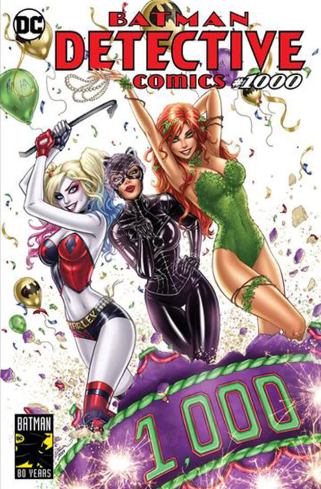
Comics Etc. Stewart "StewART" McKenny and John Law Variant Cover
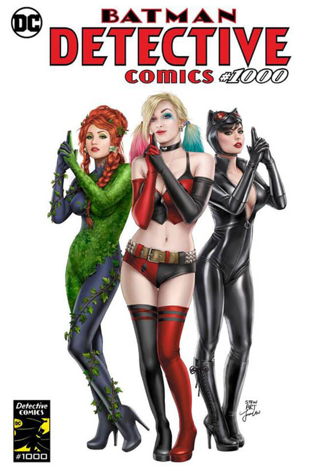
Never has so much minge made me cringe. Are we saying Batman is like Charlie's Angels? Is Batman Charlie? Then wouldn't his Angels be Batwoman, Batgirl and Catwoman? It reminds me more of Austin Powers, which if you had told me was a feeling I would experience when perusing, and I can not stress this enough, DETECTIVE. COMICS. ONE THOUSANDTH ISSUE! I would not have believed you 0 out of 10 |
|
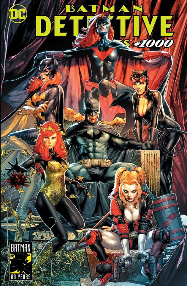
Bulletproof Comics Gabriele Dell'Otto Trade Dress Variant
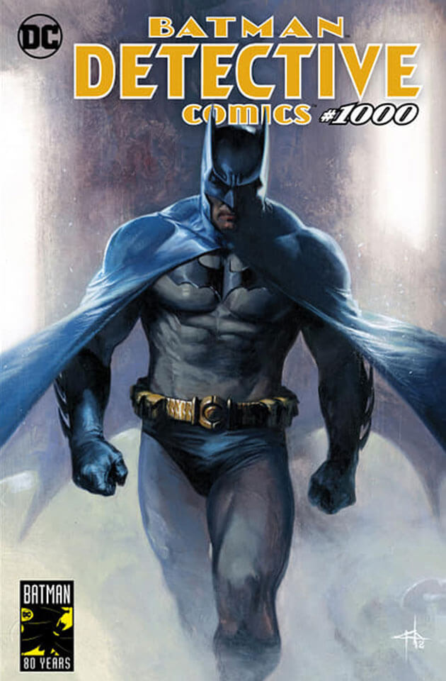
Simple, well drawn and does what it says on the tin. Making the Dark Knight look majestic in the classic blue, which let's be honest, we all prefer to the black. It does a good combination of making Batman look like a superhero and a human as well. And it's through this imagary we can maybe allude to that anyone can be the Bat if they want to be *dons cowl and goes to fight crime* 9 out of 10 |
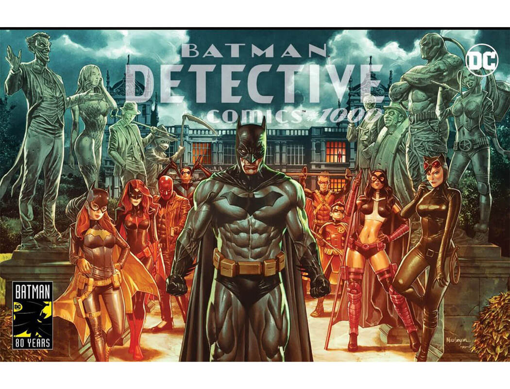
Unknown Comics Mico Suayan Trade Dress Variant Cover
This is one of those that at first glance, looks great, but on closer inspection, does not. Batgirl has some weird button nose. Catwoman is picking her nose and her face looks like PS1 Lara Croft level of detail. Batman's veins are coming through his suit, is it just painted on? And why would he have statues of all his enemies in his garden? Why would he immortalise evil? Very Chernobyl. Not great, not terrible.
6 out of 10
|
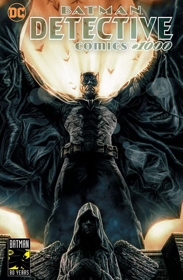
Midtown Comics Lee Bermejo Trade Dress Variant Cover
You can see why Lee was chosen to illustrate the first Batman comic to come out on DC's Black Label. No penises here though. Just am epic shot of Batman being the dark in the light. I weirdly think this is what Capullo was going for before, however this shows the difference if you just use that entire page to your advantage. Love the spooky Joker smiles in the cape. 9 out of 10 |
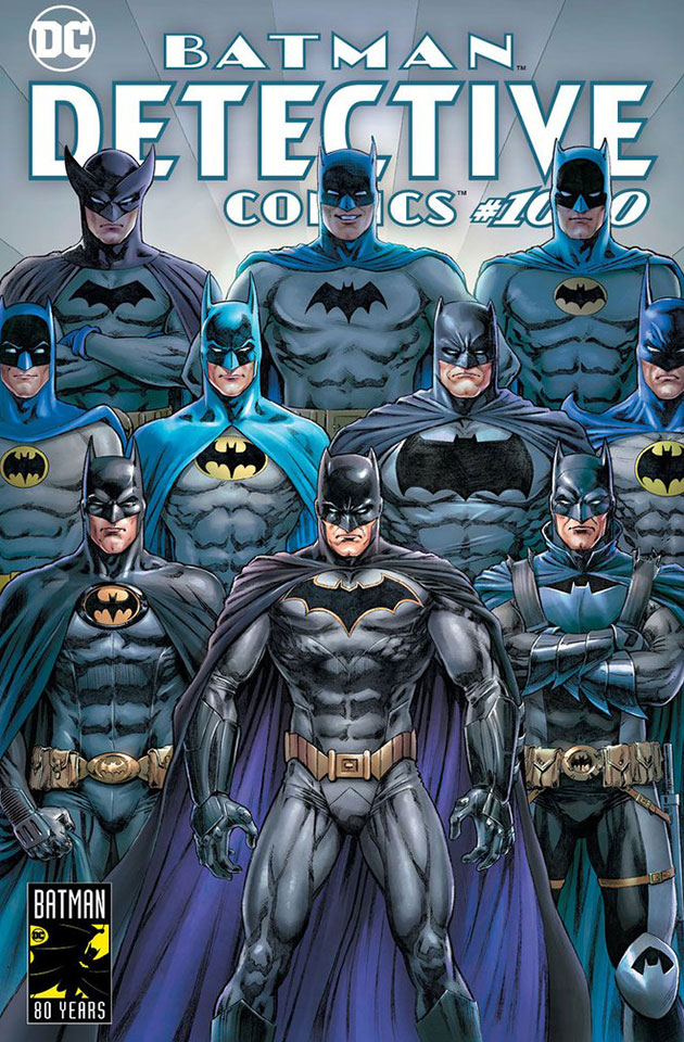
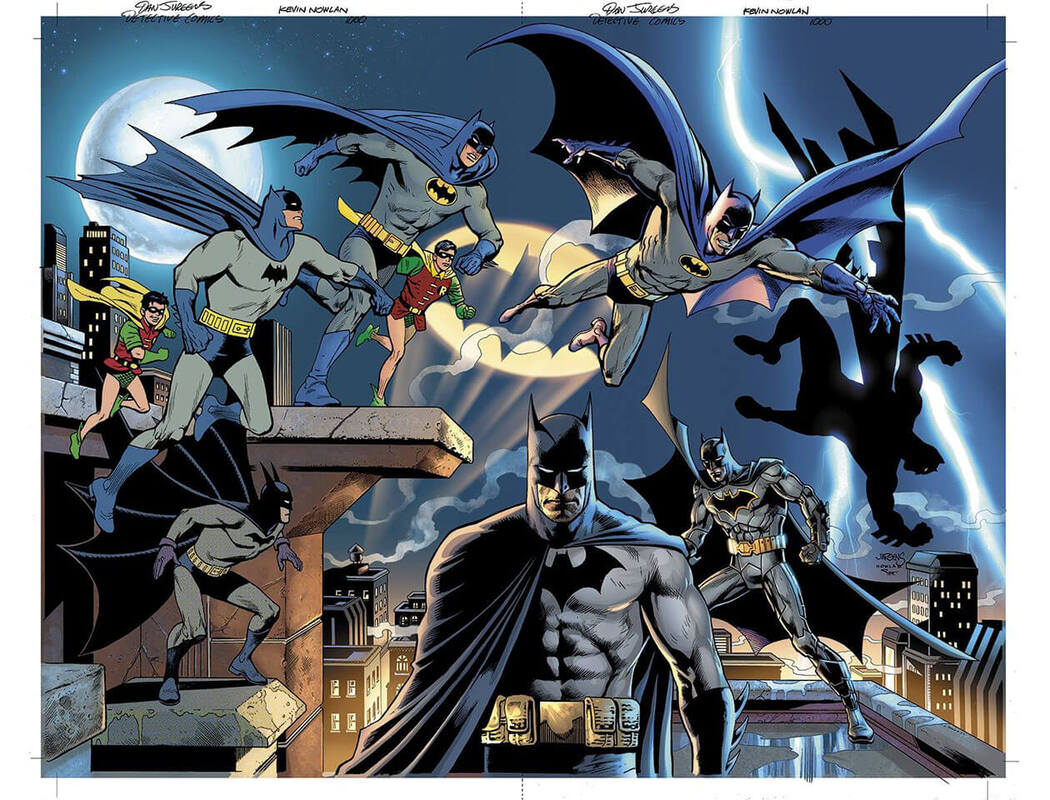
Dynamic Forces Dan Jurgens & Kevin Nowlan Variant Cover
Multiple Batmans!! Different eras all in one great cover that you know what be a great poster in your room, no matter what age you are!
8 out of 10
Multiple Batmans!! Different eras all in one great cover that you know what be a great poster in your room, no matter what age you are!
8 out of 10
|
BuyMeToys Rodolfo Migliari Trade Dress Variant Cover
I think the style of Alex Ross is extremely hard to emulate and this shows. Somehow I feel the characters look as real as those awkward cosplay parades that you can get at Comic Conventions. You know the kind. Where people who have issues socialising and making friends have to go onstage, in front of 100's of people, and perform, with confidence, their interpretation of the character they're cosplaying. This looks more awkward then heroic. 4 out of 10 |
|
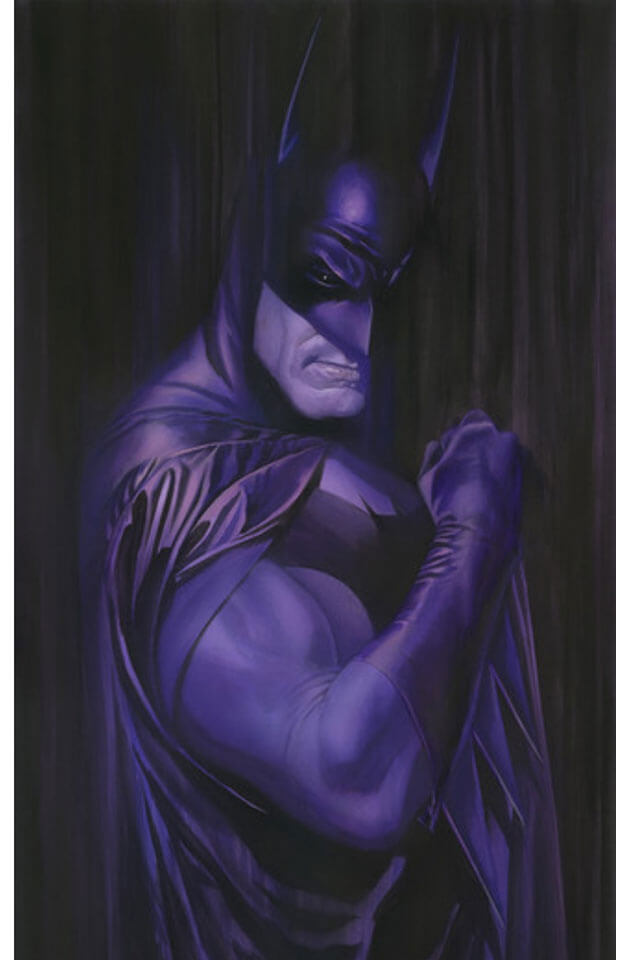
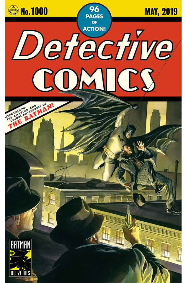
Alex Ross Detective Comics
Speak of the devil. It is genuinely ridiculous how great these covers are. Unlike the latest Disney remake of THE LION KING, this remake does not step on any toes or do a disservice to the original. And with 'original' in mind take a gander at that gorgeous purple number. Alex Ross is a true visionary with a pen. 10 out of 10 |
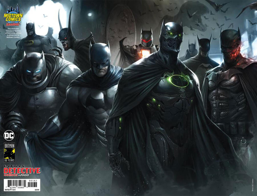
Midtown Comics Francesco Mattina Arkham Knight Variant Cover
I love a good elsewhere story and no character has had more people want to write their version of him than Batman. Here we see DKR in full armour, Flashpoint Batman, Gotham by Gaslight amongst others. A little gloomy and as well lit as Alien Vs Predator 2, still a great piece of work though.
7 out of 10
|
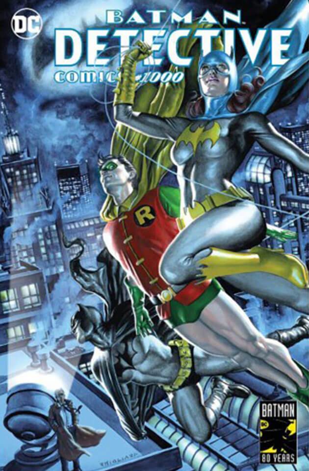
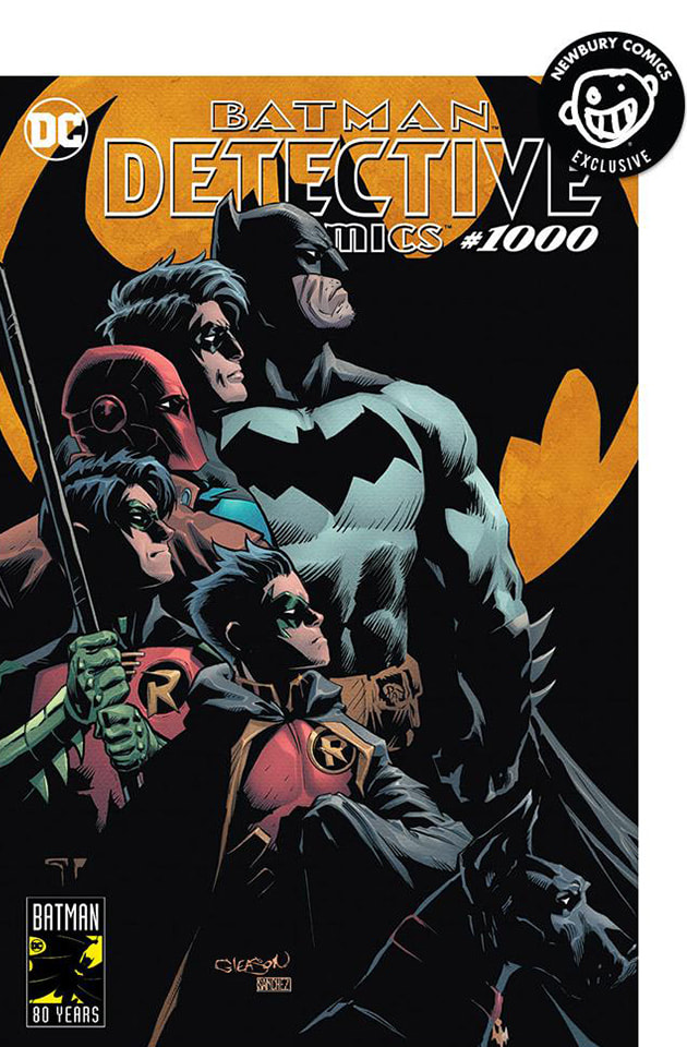
Newbury Comics Patrick Gleason & Alejandro Sanchez Trade Dress Variant Cover
A fantastic cover! Look at the poses! Look at the quality of the linework and the shading! A simple premise that speaks volumes just by the most simple things. Like having the characters in the order that they're in, the Bat-signal in the same glow as it had in BATMAN: THE ANIMATED SERIES, it's just a great looking cover. Definitely one for the wall. 10 out of 10 |
|
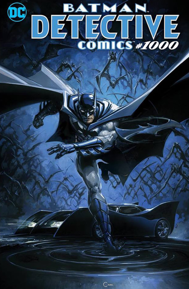
Scorpion Comics Clayton Crain Trade Dress Variant Cover
The problem with doing a single tone of colour, in this case blue, is that the whole drawing can kind of meld into itself. This action pose, complete with bats, batmobile and batarang just kind of slips into the background. It doesn't seem as powerful without a second bolder colour. It's just blue. Dabba dee, dabba da. Another Chernobyl. 6 out of 10 |
As you can see, there was a lot of covers but how many did I really gush over? How many did you gush over? Am I too critical? Or maybe...maybe I'm not what the comic art world wants, but what it needs.
Disagree? Tweet at me!
@ProJub
-Jay Burdett
Disagree? Tweet at me!
@ProJub
-Jay Burdett

